As I hinted at the end of my last post, probably the final step of pre-planning my new plugin store was to think about theme choice for the new store. I’m no designer myself, so a self-build theme is mostly out of the question. Neither am I at the level where I’d consider a bespoke theme development to be required, which leaves me with customising an off-the-shelf theme – an activity I’m perfectly comfortable with.
The problem is…
Most (e-Commerce) themes is that they’re designed to show off the products in the best light possible, and as a result they tend to be image heavy. This is an approach that really doesn’t work well if you’re selling code. Currently my store relies on screenshots on products.
While I think this is really useful in terms of people understanding the functionality available in the plugin, it’s not great for people navigating the store, or “selling” people on the product. So – I’ve decided I need product “icons” of some form.
I’ve not yet decided what they’ll be, or how complex they’ll be. My design skills might stretch that far, or I may be looking for an illustrator who can help me out – but I’m not yet convinced that’s what will be required.
Choosing a theme
As part of my original research on this project, I’d looked closely at WP e-Commerce, and WooCommerce – both of which have a broad selection of lovely looking themes. Discounting the really image heavy themes there’s still a great deal to choose from.
Since I settled on Easy Digital Downloads, and because it’s not a plugin I’ve spent a lot of time theming, I really wanted something that worked out-of-the box. Unfortunately, while there are a couple of nice themes, there’s not really as broad a choice as there is with other plugins – I think this is the only area I’d score the plugin down in.
I settled on a shortlist though:
Forelight is great, and would be fantastic for someone selling digital art or similar, but I felt it relied too much on imagery. Quota and Shop Front also got discounted as great as they are, they were a bit too plain. I thought I’d have too much design to do to make them feel polished. In the end, I settled on HumbleShop (Be careful, there’s a normal, and an EDD version of the theme available on the net – make sure you grab the right one).
Aside from throwing a few warnings during installation, I’m pretty happy with this choice so far. As you’d expect from someone who tinkers a lot, I expect I’m going to be throwing a few improvement patches the authors way – we’ll see how that goes. However – first impressions are that it’s going to deliver the sort of experience I’m looking for.
Styling it up
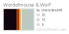
Of course, I won’t be leaving HumbleShop as-is. I’ve created a child theme already and have started playing around with styling and colour schemes. I’ve been browsing colourlovers.com for colourscheme inspiration. Again I had a shortlist (Higher, Wordofmouse & Worf, Winter Olympics, and Breakfast Berries), but after a discussion with some trusted friends – I settled on Wordofmouse & Worf:
Actually – when I say “settled” on – that might not be entirely true – after applying it to HumbleShop, I’m not quite sure it works, so it may be back to the drawing board. We’ll see…
